David Mitchell
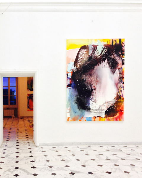
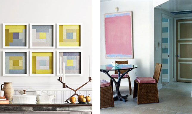
We’re always looking for colorful, graphic art for our projects and have recently come across the work of American-born artist David Mitchell (represented by Jim Kempner in NYC). While from afar Mitchell’s pieces look like they might be paintings, his incredibly color saturated pieces are actually a mix of photography and digital postproduction. Citing the Color Theory artists as some of his biggest influencers, Mitchell uses a combination of double exposures, gels, and filters to create his work. Fans of Josef Albers’ “Homage to the Square” will no doubt see the similarities in Mitchell’s work. Below, a quartet of Alber’s famous squares hang on the wall above the sofa in Todd Romano Alexander’s NYC apartment.  Below, more Color Theory art, both original and inspired by.
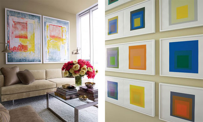
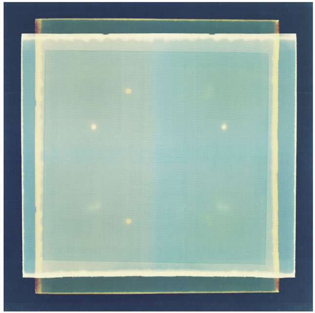
From Mitchell’s series “Abstracts 2010.” Mitchell has an incredible sense of color, combining an icy blue and watermelon red, below. 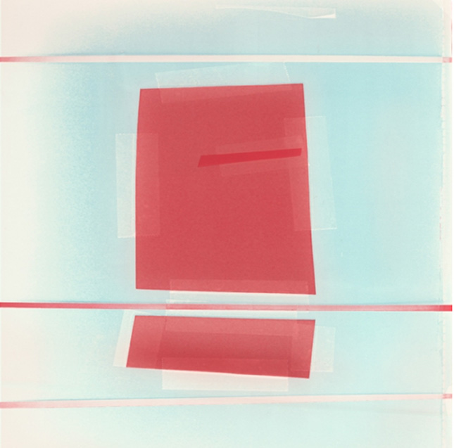 From “Abstracts 2012.” His works in blue are some of our favorites.
 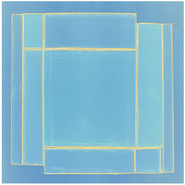 From “Abstracts 2010.”
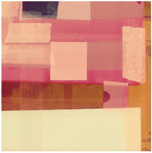 From “Abstracts 2010.”
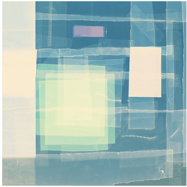 From “Abstracts 2011.”
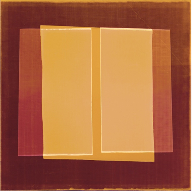 We love sharing our favorite artists with you, whether they’re new and emerging or totally established, but we know that it’s daunting to commit to some of the price tags. As an alternative, here are some great, inexpensive options from emerging and unknown artists that achieve a similar look. Take a peek at some of the pieces we found below–we’re especially fond of this piece by Oliver Gal.
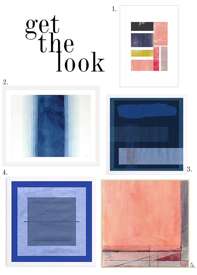
Want to see more of our favorite artists? Click here!